Testing the Layout
Re: Testing the Layout
Guduk,
The forums look good and space out nicely to fill the width of my browser window. The main page doesn't and it does look rather small on this laptop. The 1920x1200 resolution doesn't help on a 17" screen, but is there to set the fonts to use something a little larger ?
The forums look good and space out nicely to fill the width of my browser window. The main page doesn't and it does look rather small on this laptop. The 1920x1200 resolution doesn't help on a 17" screen, but is there to set the fonts to use something a little larger ?
Re: Testing the Layout
I'm slowly going to be changing the color of the "Grim Views" title on this page to see if people can see it better, if you don't like the color, just tell me and i will change it again, just trying to make it seen.


Re: Testing the Layout
still listed with the mis-entered name
it was just a simple account settings issue, and i have fixed my posting name
i think the green title to the page is easier to see than white, not sure what would be better
it was just a simple account settings issue, and i have fixed my posting name
i think the green title to the page is easier to see than white, not sure what would be better
Last edited by Kharzak on Wed May 21, 2008 8:24 pm, edited 1 time in total.
This is Wrath of Air Country! Select the superior air totem. Use Wrath of Air today!

Re: Testing the Layout
I think the green is a little hard to read against that orange/red background both for the title and for the information in the righthand corner about messages.Kharzak wrote: i think the green title to the page is easier to see than white, not sure what would be better

Re: Testing the Layout
Kharzak is going to have to redo all our signatures so they blend into the background.
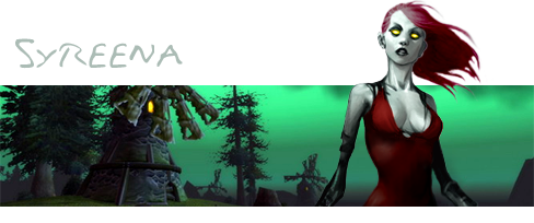
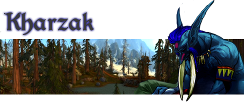
Alts: Lirsha Deathwhistle & Ayidda
Re: Testing the Layout
won't be difficult (except for blood's and mine since ours aren't as clean cut as the rest of yours), since i have all your psd files sitting around and it's dirt easy to make them into png's. and when i do that they will in fact look blended into TNG or whereever else you want to use them
just send me a pm if you want your sig changed
just send me a pm if you want your sig changed
This is Wrath of Air Country! Select the superior air totem. Use Wrath of Air today!
